Dashboards, Box Plots and Longitudinal Data
“What’s a good number Coach?” The reality is that’s not always an easy question to answer. I spent my early coaching years guilty of not consistently keeping meticulous records. Sure, we tracked real-time efforts, such as load, set and reps, but I failed to place historical and amalgamated information into longitudinal information steams. In sports science and coaching the most pertinent data we can track is our unique sample. In essence our sample is our population, and our population is our sample (this is not always the case in experimental research design). Experience comes at the user’s expense. My advice to young coaches, keep diligent records.
“My record keeping was comprehensive but really no different from that of a banker who accounts for every penny and can show you the records of transactions going back years and years.” - John Wooden
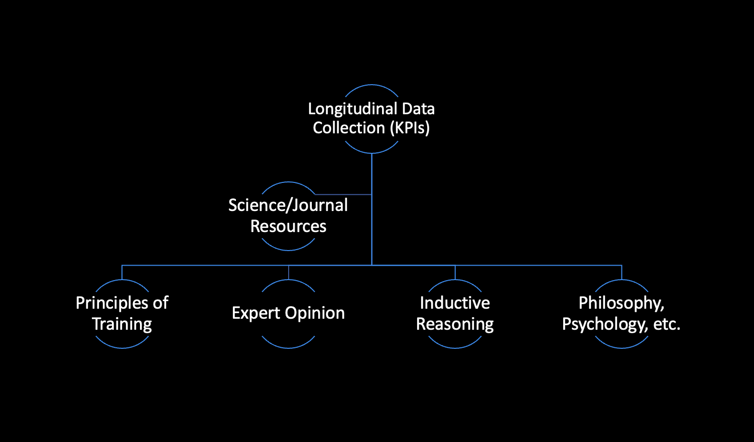
Longitudinal Data sits atop the “Evidential Substantiation” list for performance coaches.
What kind of Records?
Certainly, this answer will vary pending situation, context, and environment. At the professional level, athlete management systems (AMS) can serve to house, amalgamate, and display data to key decision makers and players alike. AMS can serve as a plug and play tool to adequately store and display relevant information. In the private sector budgetary constraints may seek practitioners to pursue alternative measures. I strongly recommend dashboard tools from fellow colleagues Adam Virgile and Dave McDowell as both of these individuals have made massive contributions to the way we display, collect and communicate our data to relevant coaches, teams and players.
Regarding our teams, we like to have a total of three dashboards/visuals handy. These dashboards provide different narratives to different individuals within the organization.
1) Team Dashboard (For the Coach):
Top 5/Bottom 5
Positional Average
Team Average
Customized Dates
2) Personal Player Card (For the Player):
KPI Tracking
Trends
Radar Chart (Athlete vs Team Standard)
3) Longitudinal Data: (Internal Record Keeping)
Team/Position Over time
I’d like to focus on #3. Pertaining to longitudinal data display, I really like the Box and Whisker Plot. Weather comparing teams, or by position, the box and whisker plot provides a fantastic pictorial narrative. Here’s a quick synopsis:

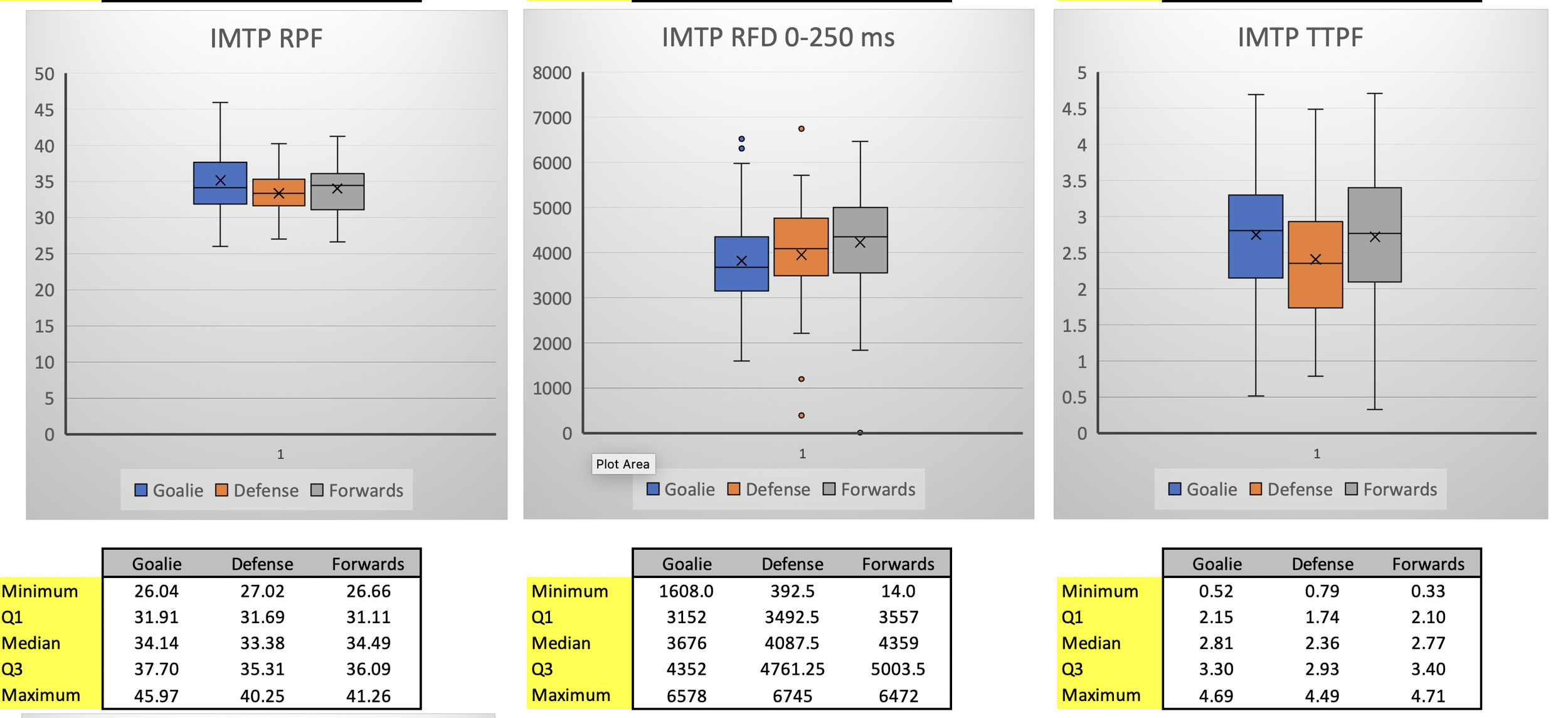
Box and Whisker Plots are an excellent visual display of the data to compare teams (Row 1), or positions (Row 2) over time.
The range of scores from the lower to upper quartile is the interquartile range. The box (aka the interquartile range) represents the middle 50% of the data set.
The middle line inside each box in the median of the data set. The median is not affected by outliers (the mean of the data set is affected by outliers). The median cuts the box in half (25% of the date on each side)
The “X” represents the mean of the data set
The lower whisker represents the bottom 25% of the data set
The upper whisker represents the bottom 25% of the data set
Outliers are marked with dots (above or below)
Box Plot interpretations:
Smaller boxes = < variability in scores
Longer boxes = > variability in scores
One box is much higher than another = difference b/w groups or positions
Different median distributions can be used to compare groups/positions
Here is how to create a box and whisker plot in Excel
Bottom line, collect longitudinal data over time. Track sample size, amalgamate and display in a way that’s easy to understand. “What’s good Coach?” is not always an easy question to answer. Metrics change, technology changes, but record keeping should not. The best we can do as practitioners is to manage, collect and communicate.